Google has officially upda
What’s New in Google’s Logo Design?
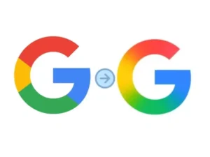
The revamped Google logo 2025 keeps the familiar color palette—red, yellow, green, and blue—but applies a smoother gradient transition across the letter “G.” This small visual update brings a more fluid, dynamic, and digital-native feel, aligning perfectly with current modern logo design trends.
Why Google Changed Its Logo in 2025
As Google continues to evolve with AI and smart assistant technology like Gemini, the brand is shifting toward a more flexible and adaptive image. The new logo represents this change visually—sleek, intelligent, and forward-thinking.
Is a Full Rebrand Coming?
Currently, only the “G” icon has changed, seen first on the Google Search iOS app and slowly appearing on Android. However, design experts suggest that other Google icons—like Chrome, Gmail, and Maps—could soon follow with gradient-style redesigns for a more unified visual system.
What Graphic Designers Can Learn from Google’s Update
This update is a case study in minimalist branding and the power of small details. Instead of a complete overhaul, Google shows how a minor refresh can keep a brand current without losing recognition.
As creative professionals, it’s a great reminder: modern design is about evolution, not revolution.